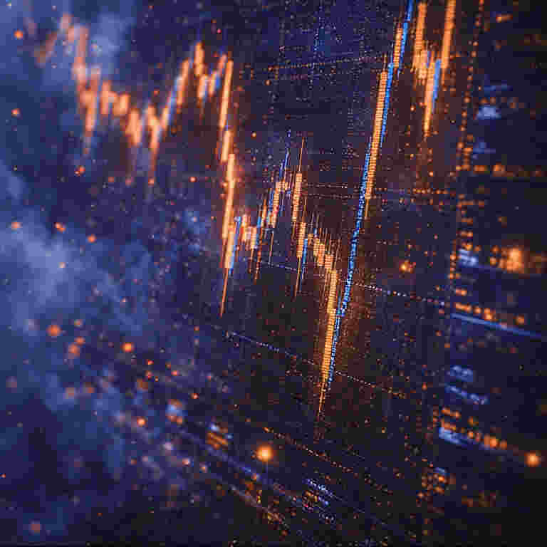
What is The Candlestick Chart?
The candlestick chart is a method of visualizing price movements in financial markets that said to be originated in 18th-century Japan, where it was used by rice merchants in the Dojima Rice Exchange to analyze the price of rice contracts. Its creator, Munehisa Homma, is often credited with developing the techniques that would later form the basis of modern candlestick analysis. Introduced to the Western world in the late 20th century, primarily through the work of Steve Nison, candlesticks have become one of the most ubiquitous and intuitive forms of charting for traders across asset classes. More than a simple plot of prices, a candlestick encapsulates the narrative of a trading period—the battle between buyers and sellers—into a single, rich visual element. This article explains the anatomy of a candlestick and explores its utility and role within the trading community. This article is not financial advice or trade advice, only an explanation.
Part 1: The Anatomy of a Candlestick
A single candlestick represents the price action for a specific, uniform timeframe—whether one minute, one hour, one day, or one week. Its structure tells a complete story of that period’s trading activity.
The Core Components:
- Real Body (The “Candle”):
- This rectangular portion represents the price range between the opening and closing prices of the period.
- Color Convention:
- Bullish Candle (Often White, Green, or Hollow): The close is higher than the open. The body’s bottom is the open price, and the top is the close price.
- Bearish Candle (Often Black, Red, or Filled): The close is lower than the open. The body’s top is the open price, and the bottom is the close price.
- Wicks (or Shadows):
- These thin lines extending above and below the real body represent the highest and lowest prices traded during the period.
- Upper Wick/Shadow: The line from the top of the body to the period’s high.
- Lower Wick/Shadow: The line from the bottom of the body to the period’s low.
A Candlestick’s Message:
The relationship between the body and the wicks reveals market psychology. A long body shows strong conviction in the direction of the move (bullish or bearish). Long wicks indicate price rejection—the market traded to a certain level but was forcefully pushed back, suggesting support (long lower wick) or resistance (long upper wick).
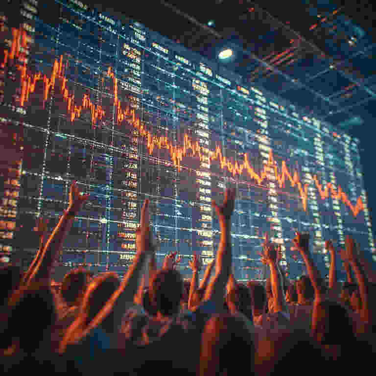
Part 2: The Utility to the Trading Community
Candlestick charts are favored because they compress a large amount of actionable information into an easily digestible format. Their utility spans several key analytical functions.
1. Efficient Visual Communication of Market Structure:
At a glance, a trader can assess the market’s condition. A series of long green candles indicates a strong uptrend. A series of small-bodied candles (Dojis) suggests indecision or consolidation. This allows for rapid pattern recognition across multiple timeframes and securities.
2. Identification of Potential Reversal and Continuation Patterns:
The primary analytical power of candlesticks lies in the recognition of specific multi-candle formations that have been observed, over centuries, to correlate with shifts in market sentiment.
- Reversal Patterns: Signal a potential change in the prevailing trend.
- Examples: Hammer & Hanging Man (single candle), Engulfing Pattern (two candles), Morning Star & Evening Star (three candles).
- Continuation Patterns: Suggest a pause in the trend before its resumption.
- Examples: Rising Three Methods & Falling Three Methods (multiple candles).
These patterns are not predictive guarantees but are considered probabilistic signals that the balance of power between buyers and sellers may be shifting.
3. Pinpointing Support and Resistance Levels with Precision:
The highs, lows, opens, and closes marked by candlesticks create clear horizontal levels on a chart. A cluster of candlestick wicks at the same price, for instance, visually defines a strong support or resistance zone more clearly than a simple line chart.
4. Insight into Intra-Period Price Action and Sentiment:
Unlike a bar chart or line chart, a candlestick explicitly shows which side—buyers or sellers—controlled the period’s closing momentum. A candle with a small body and long wicks tells a story of conflict and indecision within that period, information lost in a simple close-to-close line.
Part 3: Application in Specific Markets
In Forex Trading:
- Multi-Timeframe Analysis: Forex traders heavily rely on multiple timeframes (e.g., 4-hour for trend, 1-hour for entry, 15-minute for timing). Candlesticks provide a consistent, clear visual language across all these charts.
- Key Level Interaction: Identifying candlestick rejection patterns (like Pin Bars) at major psychological levels (e.g., 1.1000 in EUR/USD) or technical levels (Fibonacci, moving averages) is a cornerstone of many forex strategies.
- Session-Based Analysis: Candlestick patterns can be used to gauge the strength of moves during specific trading sessions (London open, New York overlap), providing context for institutional activity.
In Stock Trading:
- Earnings and Event Reaction: A candlestick chart for the day of an earnings report vividly shows the market’s reaction: a long green body indicates a bullish surprise; a long red body with an upper wick (a “shooting star” type shape) can show an initial rally that was sold off heavily.
- Volume-Price Integration: When combined with volume (displayed as a histogram below), candlestick patterns gain additional confirmation. A bullish reversal pattern on high volume is given more weight than the same pattern on low volume.
- Breakout Confirmation: A candlestick that closes decisively above a resistance level with a full body (a “breakout candle”) is considered a stronger signal than a price that merely ticks above it intraday.
Part 4: Limitations and Prudent Interpretation
The trading community acknowledges important caveats to candlestick analysis:
- Not a Standalone System: Candlesticks are a form of technical analysis and are rarely used in isolation. They are most powerful when confirming signals from other tools like trendlines, momentum indicators, or fundamental drivers.
- Context is Critical: The same candlestick pattern has a different meaning in a strong uptrend versus a consolidation range. A “hammer” at the bottom of a downtrend is a potential reversal signal; the same shape in the middle of an uptrend is just a minor pullback.
- Subjectivity in Pattern Recognition: Identifying patterns can be subjective. What one trader sees as a “bullish engulfing” pattern, another may see as two normal candles.
- False Signals: Like all technical tools, candlestick patterns produce false signals. They indicate a potential shift in probability, not a certainty.
Conclusion: The Enduring Visual Language of the Markets
The candlestick chart endures as a fundamental tool because it successfully translates raw, numerical price data into a visual story of human psychology—fear, greed, indecision, and conviction. For the forex and stock trading communities, it serves as a common graphical language that facilitates rapid analysis, communication of ideas, and the identification of high-probability trading scenarios based on historical price behavior patterns.
Its utility lies not in magical predictive power, but in its ability to organize market information efficiently and highlight moments where the market’s equilibrium is tested. When understood as a probabilistic map of sentiment rather than a crystal ball, candlestick charting remains an indispensable part of the modern trader’s analytical toolkit, connecting contemporary digital trading screens directly to the insights of 18th-century rice traders in Osaka.


2 comments